Dropdowns are among the most important elements on any website or webapps around the world.
They enable your users to make a choice within a list of several elements.
In Bubble, you easily have access to the default Dropdown element.
It works well but let's be honest, it really isn't beautiful.
If you want to create a Custom dropdown in Bubble.io, you're at the right place.
In this article, we are going to explore how you can easily create Custom Dropdowns in Bubble that really match your brand.
Ready ?
NB : We also made a tutorial on how to create custom multiselect dropdowns in bubble, make sure to read it as well !
The custom dropdown we are going to create
Dropdowns can take many forms and serve many use.
They can be used to display a list of items or serve as a menu to navigate through your app.
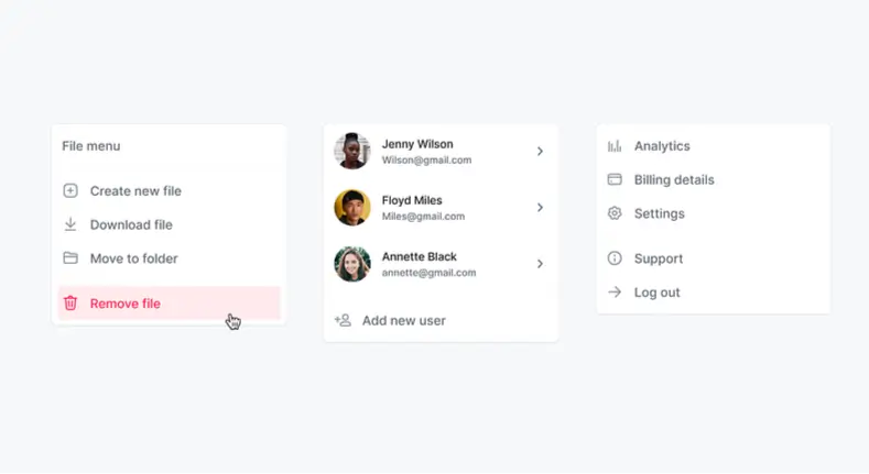
In this article, we are going to create a custom dropdown that will be used to filter a list of Users displayed in a Repeating Group.
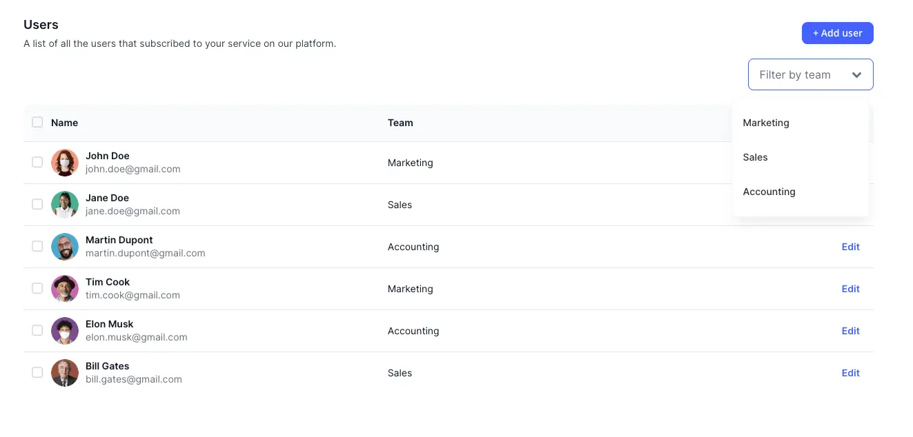
Now obviously, once you learned this method, you will be able to do pretty much any thing of custom dropdown in Bubble.
Step 1 : Building our data source
Since we are going to use our custom dropdown to filter a list of Users, we need to have an element that will display this list.
To do this, I've simply imported a Table Element from Nocodable Component's library.
This way, everything is premade, and I simply have to connect the data.
Step 2 : Building our custom dropdown in Bubble
Now comes the fun part.
The one where we really build our dropdown.
To do it, we are going to need Two main elements : a Group that will act as our button, and a Group Focus that will hold our dropdown.
First, start by dragging a group into your page and style as you want :
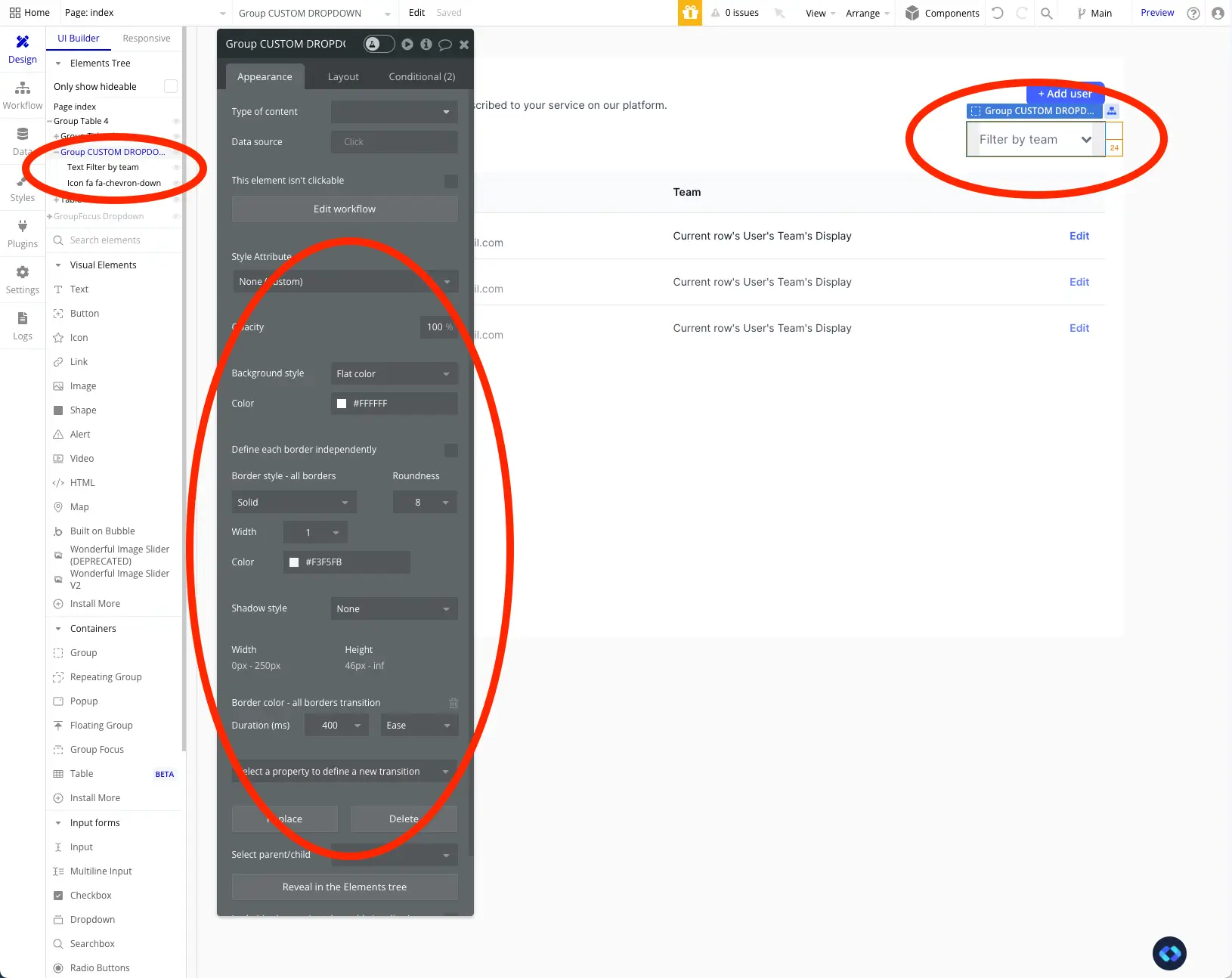
As you can see above, my Group is very basic.
It is a simple Group with a Layout Type of Row that holds a Text and an Icon element.
Nothing too fancy.
To give it a bit a dynamism and User Feedback, I have added a condition on the hover to change it's border colors.
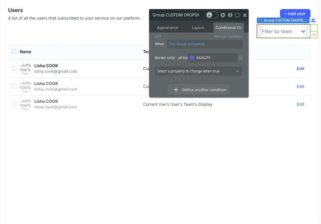
Alright, now let's focus on our Group Focus.
If you remember well, the goal of this Dropdown is to filter my list of Users based on their Teams.
Therefore, In my Group Focus, I am going to need a Repeating Group to display the list of Teams that I can use to filter my list of Users.
This list of Teams is stored in an Option Set called "Teams".
Here is how my Group Focus looks :
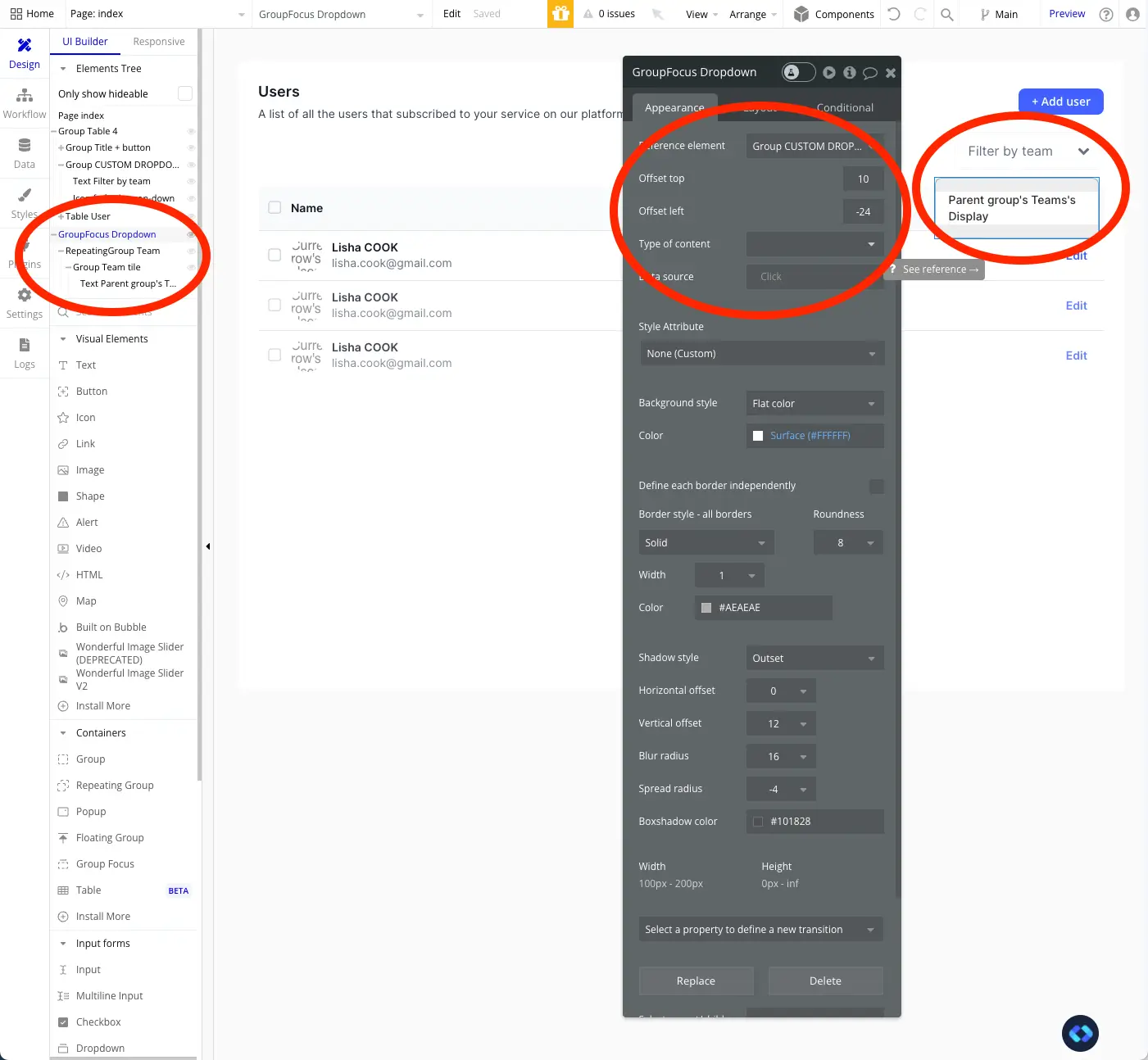
If you take a close look at the Screenshot above, you will se that my Groups Focus' Reference Element is the Button I've built earlier. This is to make sure my Group Focus sticks to the button.
You will also see that my Group Focus simply holds a Repeating Groups that holds a simply group with a Text inside.
Once again, nothing too complicated !
Step 3 : Setting up our workflows
Now that we have designed all our elements, we need to make them work together !
First of all, we need a workflow that will make our Group Focus appear :
To do this, simply add a "Toggle an element" action to your custom dropdown button, like this :
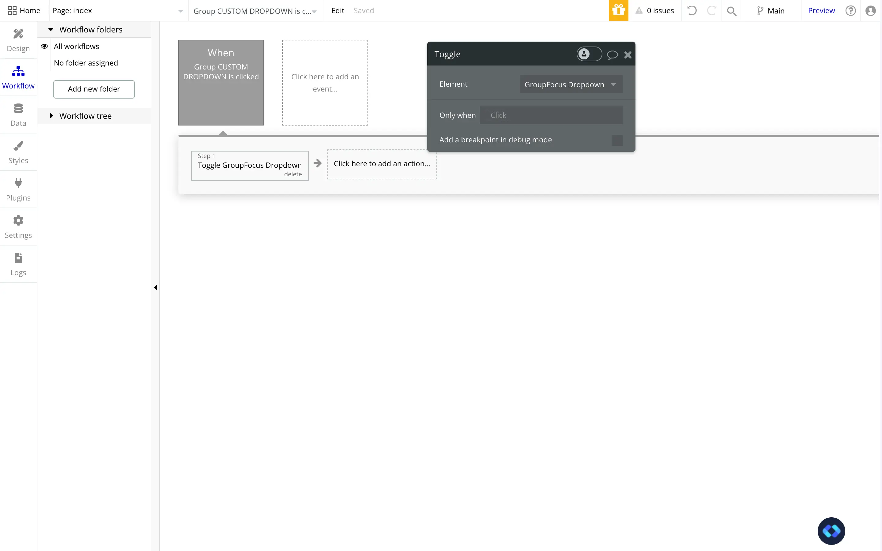
The amazing with this action, is that it will show the element when it is hidden, but it will also close it when it is visible !
So we only need one workflow to open and close our dropdown.
Alright, now we already have a functioning dropdown.
It is opening and closing, and displaying the info we need :
Step 4 - Filtering our Data based on our Custom Dropdown's value
Now we simply to make it work with our list of data (i.e the Table element).
To do this, we are going to use Search Constraints and Custom States.
The first step will be to create our Custom State.
In short, this custom state is going to store the value we want to use to filter our data source.
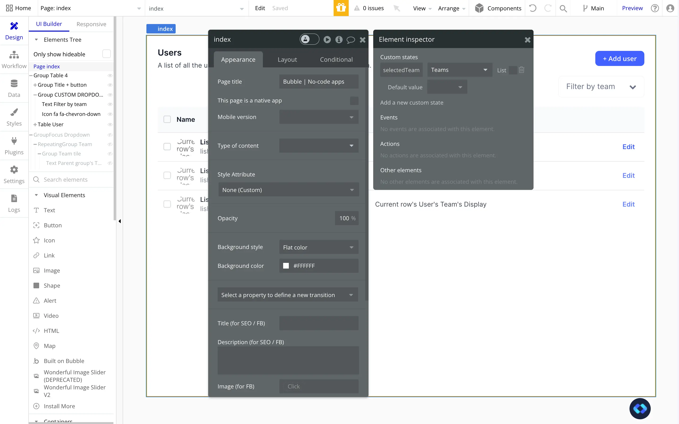
You can add it on any element you like. In this case, I added it to the page, to easily find it later on.
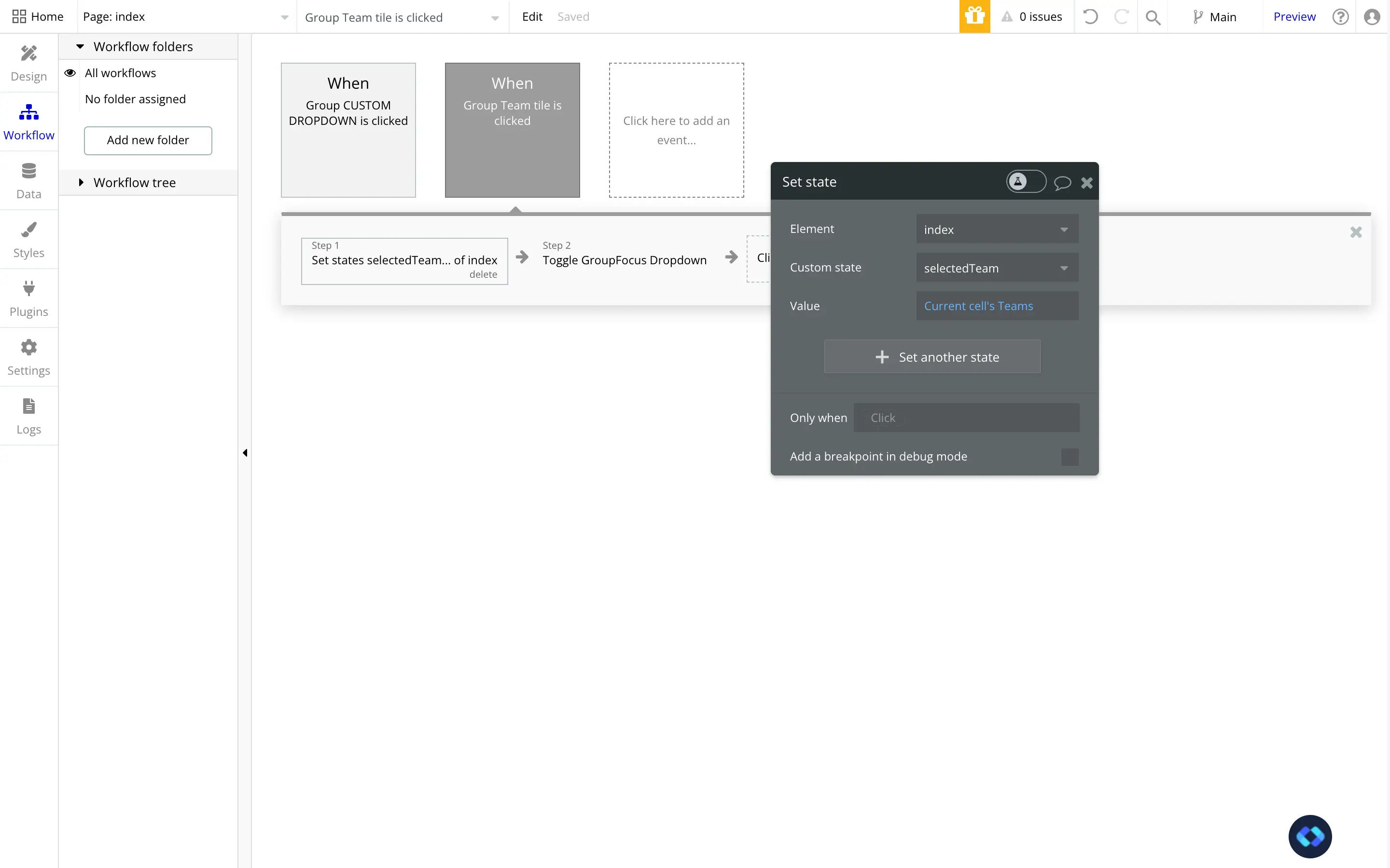
Now that our Custom State is set up, we can add a Workflow to our Dropdown to update our Custom State with the adequate value !
What you simply to add is a "Set State of an element" action, select your Custom State and give it the value of the Current Cell, as shown in the screenshot below.
As you can see, I also added a "Toggle an Element" action to close the dropdown when the value is selected.
Finally, let's add a simple condition that will update the text in our Dropdown's button to show the value of our Custom State :
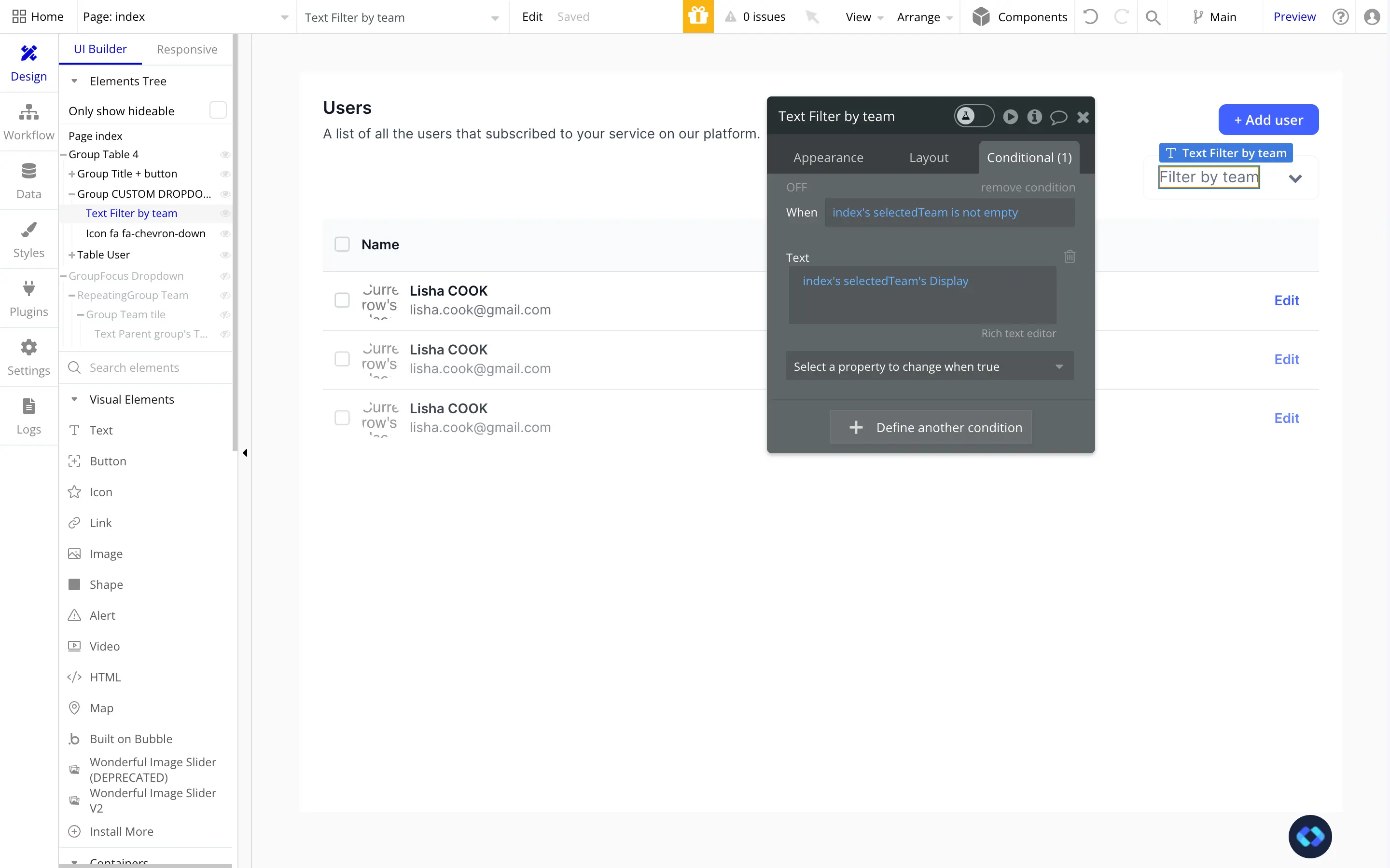
This condition simply changes the text of our Element if our Custom State is not empty (i.e if a value has been selected by a user).
Now here comes the last step : filtering our list of Users!
To do this, simply go into the Data Source of your Repeating Group and a constraint to your Search :
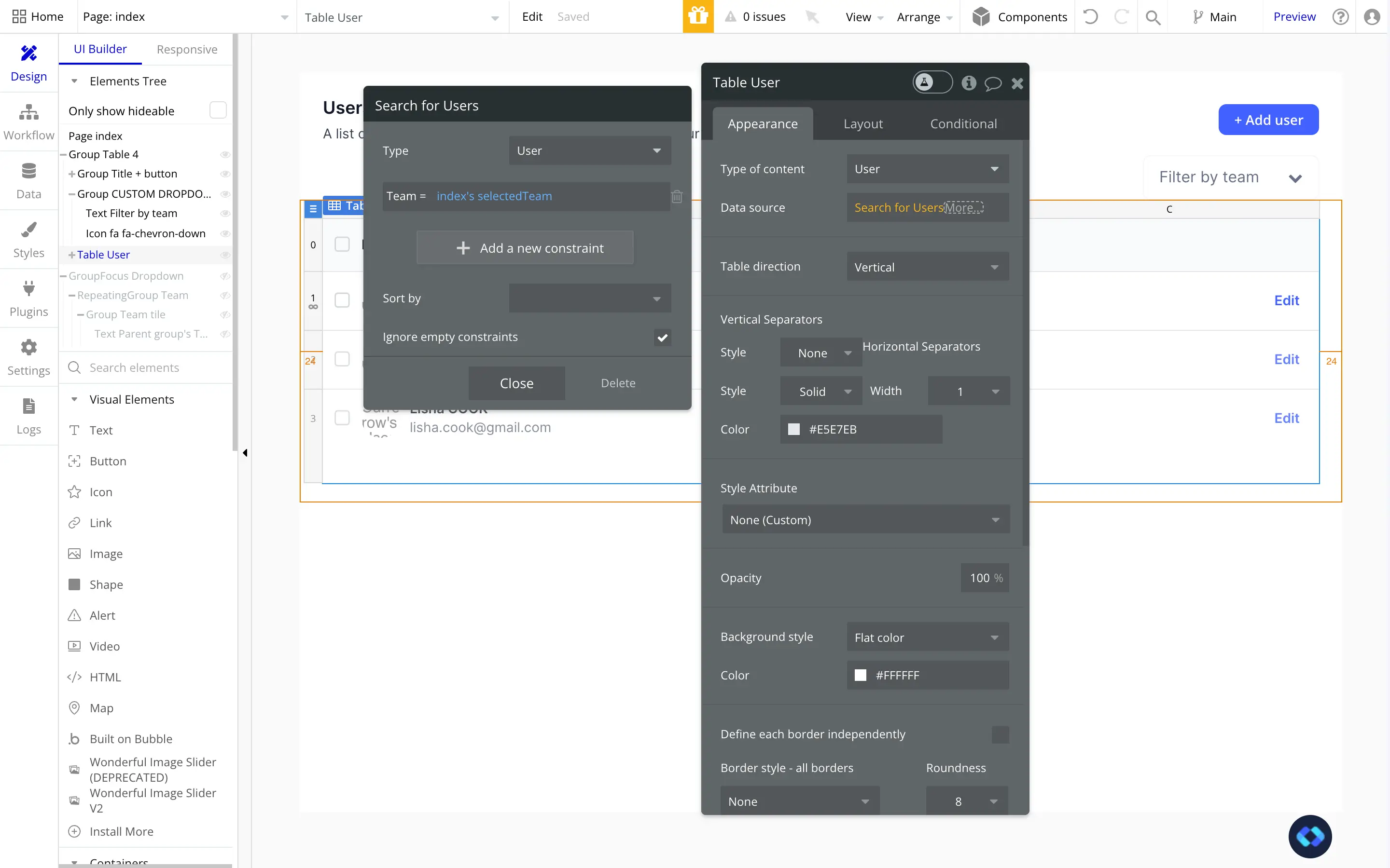
As you can see, I made sure to check the box "Ignore empty constraints", this is very important, so don't forget it !
And there we go, we now have a fully functioning custom dropdown elements made in Bubble !
How cool is that ?


